Class Example: OrthoVenn3
Introduction
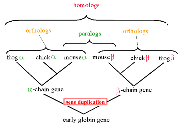
Homology is an important concept in bioinformatics, as well as in biology as a whole. We can say a lot about the evolutionary history of a DNA sequence and its corresponding protein based on its similarity to other sequences.
OrthoVenn3
OrthoVenn3 landing page is a web-based tool for ortholog discovery. It makes use of either OrthoMCL or OrthoFinder algorithms to assign orthologs based on sequence similarity. You can opt to perform a phylogenetic analysis as well an expansion and contraction analyses. If you provide a gff, collinearity analyses can be performed to visualise macrosynteny. (Here it is important to note it does not consider intergenic regions, only ortholog prediction).
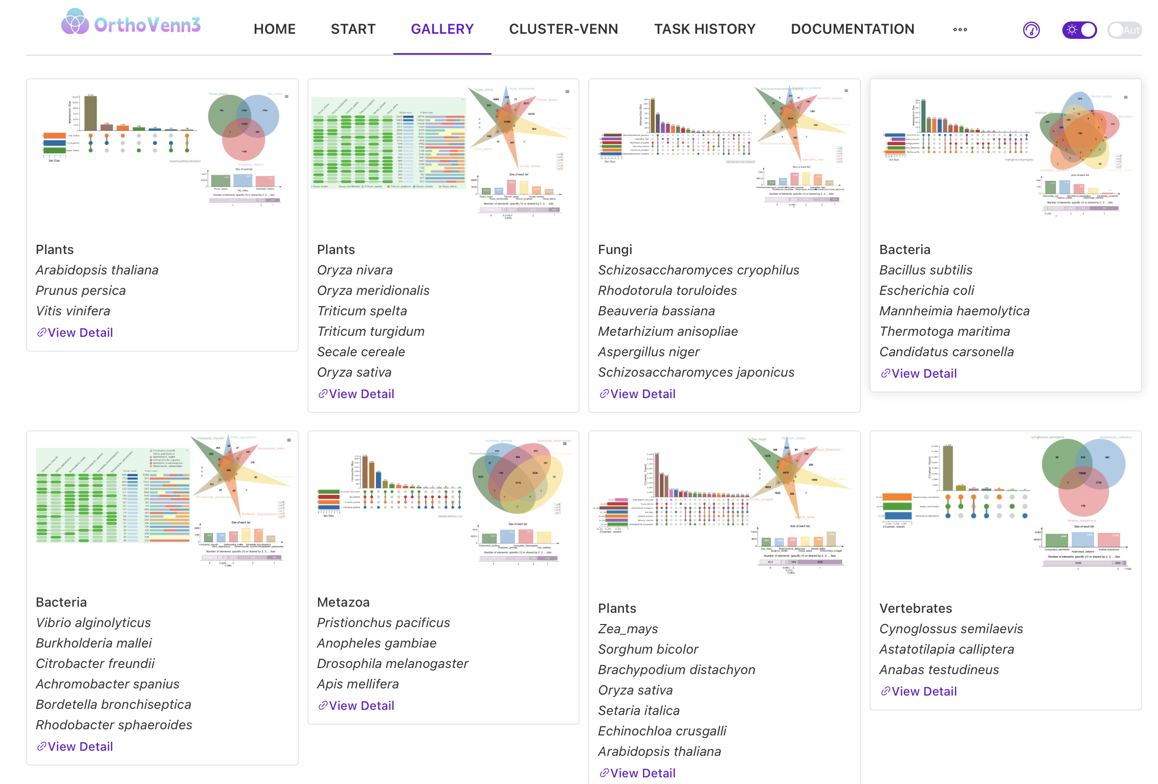
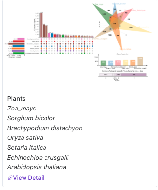
You can select up to 11 distinct datasets of proteins to analyse. These datasets can include proteins from your own genomes that you upload and/or the datasets provided by the authors. There are a variety of proteomes from all domains of life available to choose from under the Start tab. We are going to use previously computed datasets from the Gallery tab.
If you want to try and see what your favourite species from the list might look like, or if you have a proteome from NCBI, feel free to start that at the beginning of the session. It takes a bit of time to compute, and if the whole class submits a run at the same time, we might end up running out of time.
Orthologous analysis
The orthologous analysis tab contains a lot of information! Upset plots are a wonderful way to show a complex datasets. In the Cluster Count bar chart area, you can see how many ortholog clusters are in each subset. Subsets are defined by how many individual species have at least one representative of the ortholog cluster. The dot plot below the bar chart shows which species are represented in the subset. Next to the dataset name, you can find how many ortholog clusters are present in the total dataset. You can have a different representation under occurence, but I find Upset plots more informative!
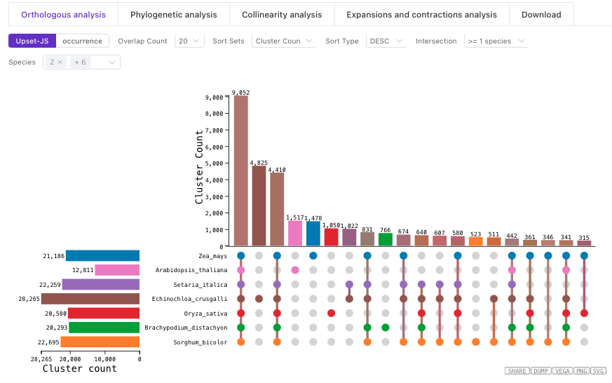
You can also see a Venn diagram of how many clusters are shared between species. This visualisation has more limitations than the Upset plot purely because of the space required for overlaps.
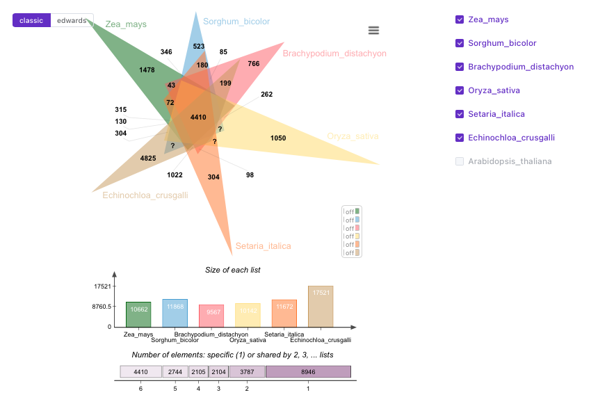
The results are also available in an interactive table. Singletons are clusters where only one sequence is in the cluster from each species in the analysis.
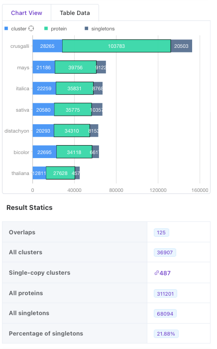
The Upset plot, venn diagram, and result table are all interactive. You could click on the bar on the left for clusters present in all species to take you to a description of the annotation of these clusters. You can see how many proteins are in the cluster, the Swiss-Prot hit. You can also see the GO terms represented by the orthogroup
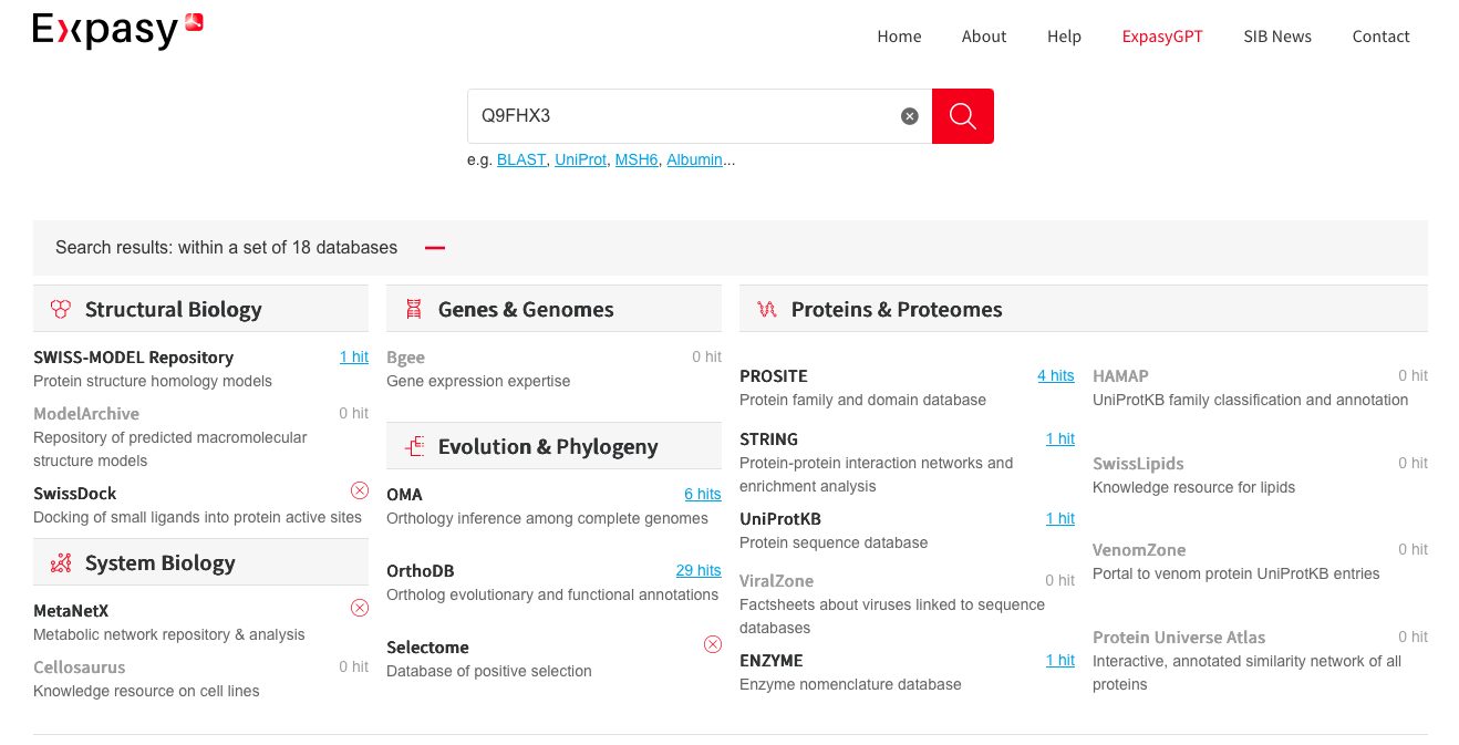
This shows how important it is to ensure that your work subscribes to FAIR principles! You can query between databases and collect all available information with little difficulty. Imagine if everyone was just doing their own thing with their own databases…
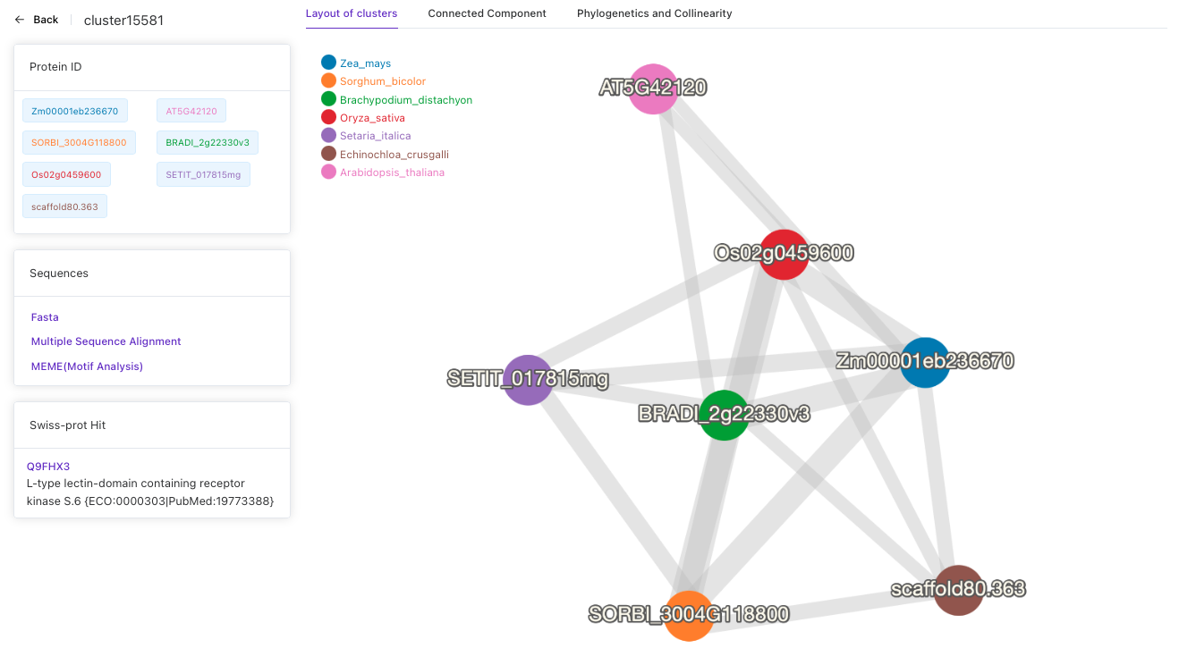
From this page, you can download the fasta sequences of the cluster in .fasta format. You can have a look at the motif analysis, and perform a multiple sequence alignment.
Please have a look at the other class example to see some other cool tools you can use to characterise the sequence, and go through some of them.